Subject
Posthumous work by 'Lolita' author bends book standards ...
From
Date
Body
http://www.pittsburghlive.com/x/pittsburghtrib/ae/books/s_656078.html
Posthumous work by 'Lolita' author bends book standards
By Rege Behe, TRIBUNE-REVIEW
Sunday, December 6, 2009
The cover
The cards
About the writer
Rege Behe can be reached via e-mail or at 412-320-7990.
Ways to get us
Chip Kidd's ultimate project was an impossible pipe dream. A Penn State graduate who has designed book covers for authors including Cormac McCarthy, Augusten Burroughs, John Updike and Dean Koontz, Kidd wanted to create a first-edition cover for a novel by one of the most celebrated authors of the 20th century.
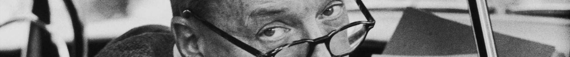
The only problem was Vladimir Nabokov, the author of "Lolita" and "Pale Fire," died in 1977, nine years before Kidd graduated from college.
Then came the news that Dmitri Nabokov was going against his late father's wishes to publish "The Original of Laura (Dying is Fun)," an unfinished novel Vladimir Nabokov started in his last years. In the introduction to the uncompleted work, Dmitri Nabokov notes that his father wished to have the work burned if not finished at his passing. After more than 30 years of fielding questions about possible publication of "The Original of Laura," the son decided it was time to publish his father's last work.
He writes "having noticed that people the world over find themselves on a first-name basis with me as they empathize with 'Dmitri's dilemma,' I felt it would be kind to alleviate their suffering."
Enter Kidd, an associate art director with the book's publisher, Alfred A. Knopf.
"It's kind of amazing to me that it took this long to do it," Kidd says. "I'm deeply grateful; somebody else could have been the designer. For me, it was a dream come true to design the last first edition by one of the greatest writers of the 20th century."
It was also one of the more challenging assignments the Reading, Berks County, native has encountered by the nature of the material. Instead of typed or handwritten pages, Vladimir Nabokov left behind 138 3-inch by 5-inch index cards that his son took painstaking measures to organize and arrange.
Kidd — who wanted desperately to get his hands on the original notecards but was reduced to working on photographs — came up with a novel concept. Each index card is replicated exactly, with words crossed out, underlined or erased, and Nabokov's notations, and printed on stock that is similar to note cards. Readers, if they so choose, can punch out each card and re-arrange them to their preference.
"If we just did it with text, it literally wouldn't have the same impact," Kidd says. "You wouldn't have had the heft; it's more appropriate for the idea to use the cards."
Of course, because the cards can be punched out and re-arranged at the whim of the reader, there are Nabokov completists who will want (or need) to buy two copies of "The Original of Laura."
"There is that," Kidd admits. "It's kind of sneaky on our part. Or not sneaky at all, because we're upfront about it."
The story line of "The Original of Laura" is naturally fragmented and concerns a young, promiscuous woman who is married to an obese, intellectual neurologist. The elusive, fragmentary nature of the text is illustrated by way of Kidd's jacket design: white lettering that fades to the right, on a black background.
Kidd's original idea was to have the typography "written out in pencil, then erased," he says. "But that seemed too tricky in the wrong way. We wanted something more elegant, more befitting Nabokov himself. To me, it's a relatively simple solution."
The designer had more leeway to experiment on the hardbound cover. The front is a reproduction of the last card, on which Nabokov wrote the words "efface" (circled), "expunge," "erase," "delete," "cut out," "wipe out" and "obliterate." Wrapped around the spine and extending to the back cover is the first card, with the title, "Ch. One" and text.
"I love to play with the binding, which is the real structural cover of a book," Kidd says. "You can obviously have a lot more fun with that. There's much more latitude of what it can be because it doesn't have to do what the cover does, which is tell you what the book is and what the mood is. With the binding you can do whatever you want."
Search archive with Google:
http://www.google.com/advanced_search?q=site:listserv.ucsb.edu&HL=en
Contact the Editors: mailto:nabokv-l@utk.edu,nabokv-l@holycross.edu
Visit Zembla: http://www.libraries.psu.edu/nabokov/zembla.htm
View Nabokv-L policies: http://web.utk.edu/~sblackwe/EDNote.htm
Visit "Nabokov Online Journal:" http://www.nabokovonline.com
Manage subscription options: http://listserv.ucsb.edu/